abhinav314.github.io
Financial Portfolio Management using RShiny
Business Objective
For an Asset Manager who does not have the time and bandwidth to carry out sophisticated financial analysis, the portfolio management dashboard is a very effective tool. Since it is algorithm-driven, the dashboard also provides more accurate recommendations based on real-time data.
The portfolio management tool addresses the two key questions of a potential retail investor:
- Which are the stocks that should one invest in?
- How much should one invest in each of these stocks?
The dashboard generates a portfolio of stocks optimized for four different profiles of investors:
- The high-return investor: Maximize ROI
- The risk-averse investor: Minimize risk
- Diversified portfolio profile: Constraints (min-max) on stock options to maximize ROI
- Balanced portfolio investor: Maximize Sharpe Ratio
On average, the optimizer tool would match the S&P annual return of ~0.01 whereas the average retail investor typically gets a return of 6% on his/her stock investments.
Data Gathering
I narrowed down our focus to S&P stocks which are typically more attractive for the Asset Managers whose clients are retail investors. The stock data is imported from Yahoo Finance (starting from Jan 1st, 2013)
Since the data is already in a clean, structured, and standardized format, I did not apply additional data cleaning methods. I used financial functions to generate returns/get inherent risk (standard deviation) for every stock.
The data granularity is at a daily level – this data is used to generate the technical indicators

Methodology Selection
I designed the product to support the investor in each step of the decision process:
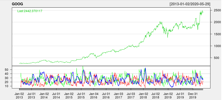
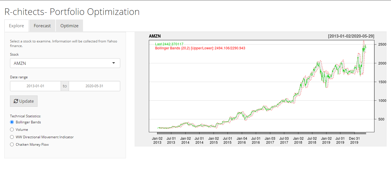
- Explore (descriptive analytics): Identify the stocks and review their past performance. Filter down the stocks that have good finance ratios/technical indicators.
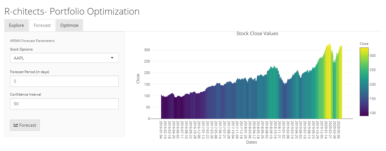
- Forecast (predictive analytics): Estimate the expected growth of a stock based on current trends. This analysis is used to further filter the stocks for the portfolio.
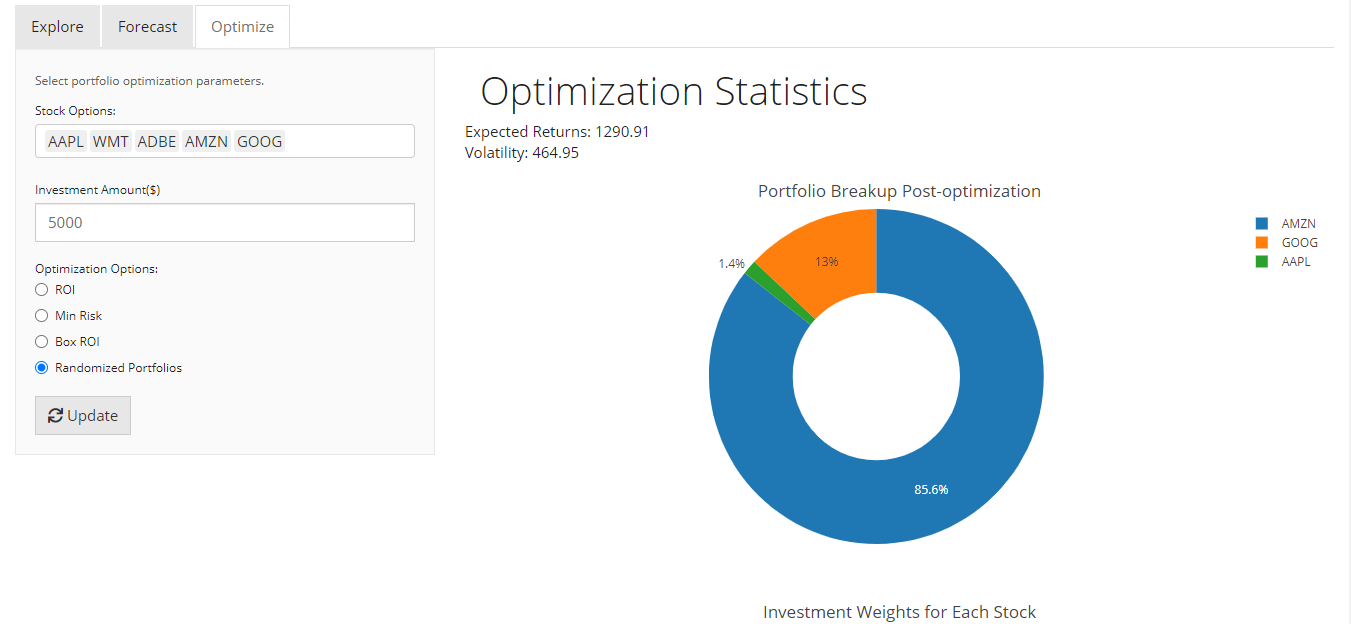
- Optimize (prescriptive analytics): An optimized portfolio curated to the investor’s specifications.
This allows the asset manager to split the funds optimally across individual financial assets. Pre-existing libraries such as quantmod, PortfolioAnalytics, dplyr make R the ideal tool to develop this application. Moreover, Shiny with R served as an excellent visualization platform.

Data Modeling
To calibrate the model in time series, data was checked for stationarity through the ADF3 test. ARIMA4, a widely used time series algorithm, was leveraged to deploy the “Forecast” module and to estimate the return from stocks. This estimated ROI data is fed into four different optimizer models that cater to the different profiles of investors.
As discussed in the “Business Problem” section, different models allocate weights based on specific objective functions and user-defined constraints. The objective functions in each of these models aim to either maximize Sharpe Ratio and/or maximize returns and/or minimize the risk in the portfolio.
The team has rigorously stress-tested these optimization models to account for fringe cases and launched a fully productionable version of the model after multiple iterations. This testing Is done by validating for optimization models by relaxing constraints.

Functionality and GUI Design
The dashboard has 3 separate windows serving each of the modules described above, viz., Explore, Forecast and Optimize. The Yeti theme and sidebar panel layout make the user interface in the dashboard neat, sleek and seamless. The interactive plots in the dashboard highlight information at different hierarchial levels.
Further functionalities that can be added to the app would be increased forecasting models to account for multiple regressors. Also highly advanced versions of optimizers can be deployed to obtain global optima in portfolio management.
